TidyTuesday Week 7 - 2021
I was excited to see the week 7 TidyTuesday (tt) data was from The Urban Institute, which is a prominent leftward leaning think tank in Washington D.C. Though seemingly everything can be partisan these days, the Urban Institute continues to produce data rich contributions to provide informative policy recommendations. In addition, the organization is highly transparent in their methods and the data used, which in turn enables other researchers and data users. Readers will find the institute’s Housing Finance Policy Center serves as inspiration for a number of previous posts on housing finance.
The TidyTuesday data spans a number of different data sets relating to wealth and income across demographic groups over time (Urban Institute App can be found here). For this post, I also bring in a secondary source of data from research conducted by Raj Chetty and the Opportuinty Insights team, which helps illuminate how generations and status can impact future demographics.
Code and visual for both below – detailed notes on the data, sampling methods and sources can be found on the links provided above.
Setup
We load the packages we’ll be using, define functions to read in the data and define a color palette which will be used for our plots
if(!require(pacman)){
  install.packages("pacman")
  library(pacman)
}

p_load(tidyverse, scales, ggdark,
       readr, lubridate,
       janitor, viridisLite, readxl,
       ggtext, ggrepel, fs)


col_pal <- c("#bc2d4f", "#f68d28", "#00abd0", "#6460aa")
# library(tidytuesdayR)
# tt_datasets(2021)

# TidyTuesday Data Set
# Filters data sets of interest
# Extracts the data set from the list of all the data to our working environment

# Moved files to local, to reduce API limit on github
# get_data_of_interest <- function(x){
#   d_in_all <- tidytuesdayR::tt_load(2021, week = 7)
#   data_of_interest <- c("income_time",  "lifetime_wealth")
#   d_in_sub <- d_in_all[data_of_interest]
#
#
#   list2env(d_in_sub, .GlobalEnv)
#
# }

# Opportunity Insights Data Set
# Sources specific tables of interest from the site
# The dol_income_url dataset is used as a cross-walk data file to compare
# percentile rankings.

# The authors of the original data have very detailed notes on sample size, sources and methods.
f_chetty_generational <- function(ptile_rank_url = NULL, dol_income_url = NULL){
  dol_income_url <- "https://opportunityinsights.org/wp-content/uploads/2018/04/table_5.csv"
  ptile_rank_url <- "https://opportunityinsights.org/wp-content/uploads/2018/04/table_1.csv"

  d_rnk_in <- read_csv(ptile_rank_url)
  d_dol_in <- read_csv(dol_income_url)

  d_combined <- left_join(d_rnk_in, d_dol_in, by=c("par_pctile"="percentile"))

  return(d_combined)
}
Read-in data uses for our plots
# Tidy Tuesday data sets
# Returns: income_time, lifetime wealth data sets for plotting below

# get_data_of_interest()

data_path <- "../../static/data/tt-wk7-wealth/"

income_time <- dir_ls(data_path, regexp = "income")%>%
  read_csv(.)

lifetime_wealth <- dir_ls(data_path, regexp = "2_lifetime_wealth")%>%
  read_csv(.)
# Compare Mean Children Household Rank v. Parent Household rank (income)
# see function above for URLs of data
d_chetty_full <- f_chetty_generational()
Build graphics from datasets
For most of the plots, we first take a subset dataset that will be used for labels or the scale of the graph, then we visualize the data.
Income distribution over time
# Calculate difference in raw terms between ntiles of income
d_income_time_diff <- income_time%>%
  pivot_wider(names_from = percentile, values_from = income_family)%>%
  mutate(Percentile90_to_10 = `90th` - `10th`,
         Percentile90_to_50 = `90th` - `50th`,
         Percentile50_to_10 = `50th` - `10th`)


p1_income <- income_time%>%
  filter(str_sub(year,-1)==0 | str_sub(year, -1) == 5)%>%
  ggplot()+
  geom_segment(data = d_income_time_diff%>%
                 filter(str_sub(year,-1)==0 | str_sub(year, -1) == 5),
               aes(x = `10th`, xend = `90th`,y = year, yend = year),
               linetype =2 )+
  geom_point(aes(x = income_family, year, color = percentile),
             size = 3, alpha = .9)+
  geom_text(data = d_income_time_diff%>%
              filter(str_sub(year,-1)==0 | str_sub(year, -1) == 5),
            aes(x = `50th`*1.85, y = year,
       label = paste0(round(Percentile90_to_50/10^3, 1),"K")),
       vjust = -0.5)+
  scale_y_continuous(breaks = seq(1965,2015,5))+
  scale_x_continuous(breaks = seq(0,200000,15000),
                     labels = function(x) paste0(round(x/10^3,0), " K"))+
  scale_color_viridis_d("")+
  labs(title = "When the 50th percentile is not enough",
       subtitle = "Growing difference in income percentiles over time",
       x = "$",
      y = NULL,
      caption = "Urban Institute, U.S. Census, Decennial/ACS-5yr")+
  theme_minimal()+
  theme(legend.position = "top")


p1_income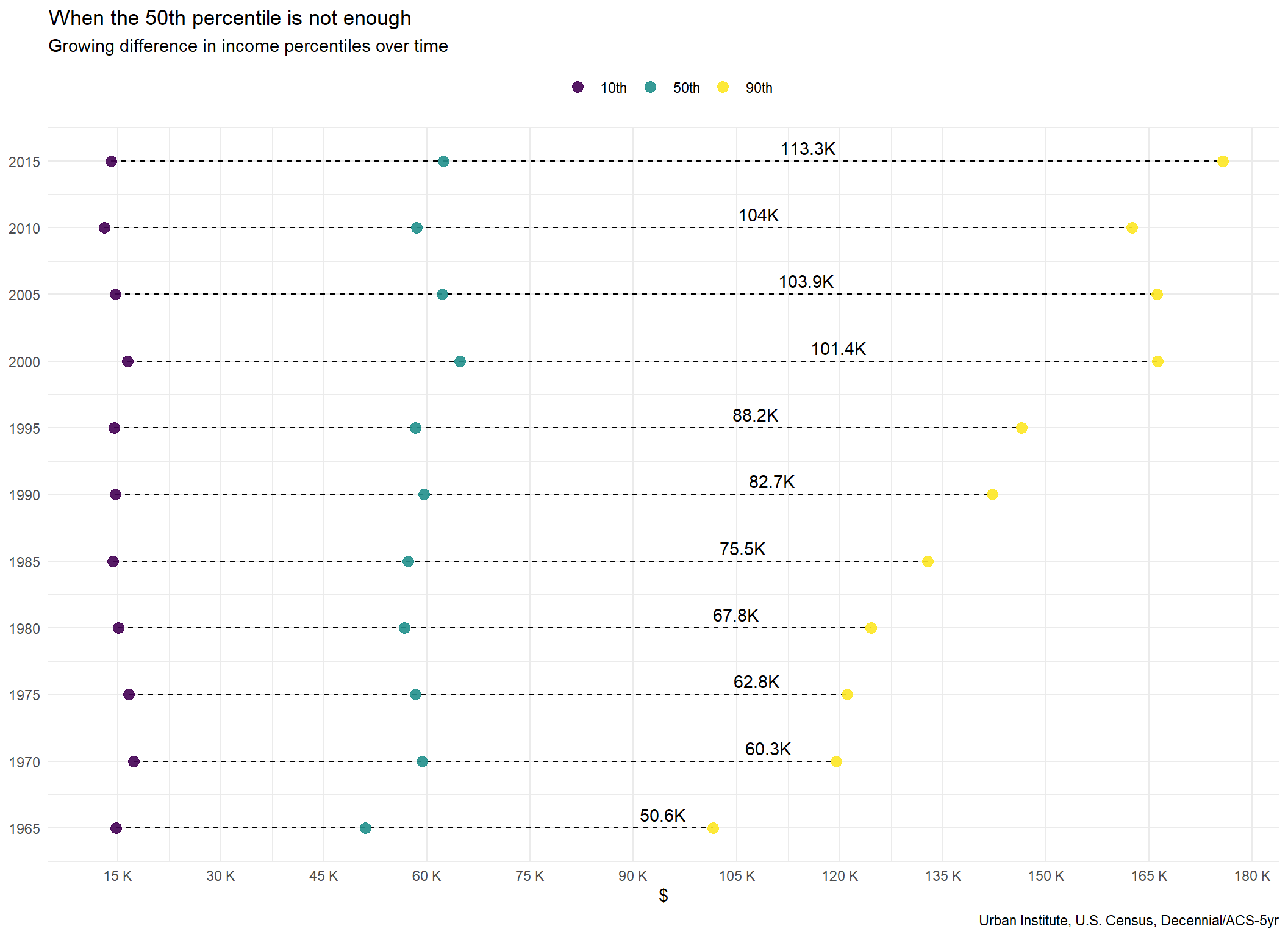
Lifetime wealth between White and Black Americans over time
p2_wealth <- lifetime_wealth%>%
  filter(type == "Median")%>%
  filter(year > min(year, na.rm = T))%>%
  ggplot(., aes(x = year, y = wealth_lifetime))+
  geom_line(aes(group = year), size = 1)+
  geom_point(aes(color = race), size = 14)+
  geom_text(aes(label = paste0(round(wealth_lifetime/10^3,1), "K")),
            size = 2.75, fontface = "bold", color = "white")+
  scale_x_continuous(breaks = lifetime_wealth$year,
                     label = lifetime_wealth$year)+
  scale_y_continuous(breaks = seq(0,425000, 25000),
                     labels = function(y) paste0("$",round(y/10^3, 0), "K" ))+
  scale_color_manual(values = col_pal[c(1,3)])+
  coord_flip()+
  theme_minimal()+
  theme(legend.position = "none",
        plot.subtitle = ggtext::element_markdown(size = 14))+
  labs(title = "Comparison of lifetime wealth in the United States",
       subtitle = "<span style = 'color:#bc2d4f'> Black </span> vs.
                <span style = 'color:#00abd0'> white </span> lifetime wealth",
       x = NULL,
       y = NULL)

p2_wealth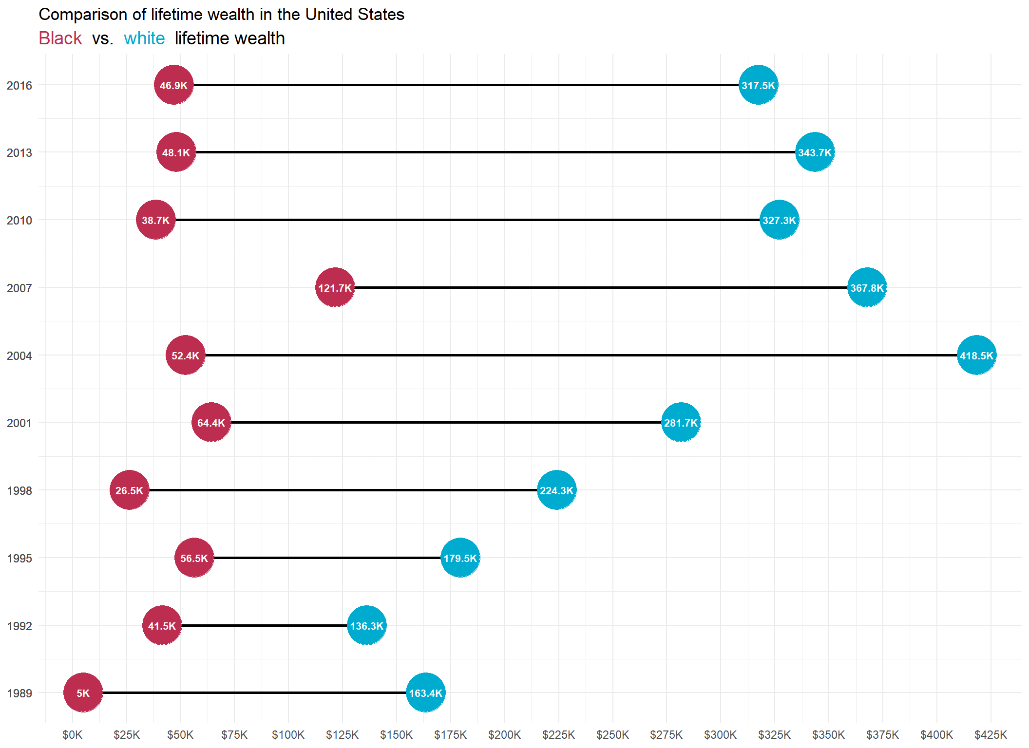
Comparing parent household income rank versus average children household rank
A detailed description of the fields and methodology used can be found here. In short, we are comparing linked household data of parents and then their children which demonstrates the influence of parental income status on future generations.
# Clean up labels for plot
d_chetty_sub <- d_chetty_full%>%
  select(par_pctile, parent_hh_income, contains("kfr_black"), contains("kfr_white"))%>%
  gather(variable, value, -c(par_pctile, parent_hh_income))%>%
  filter(!grepl(variable, pattern = "pooled"))%>%
  mutate(variable = gsub("kfr_", "", variable)%>%
           str_to_title(.)%>%
           gsub("_", " ", .))

# Optional if you want to add what the household income
# associated with each quartile

chetty_labs <- d_chetty_sub%>%
  filter(par_pctile %in% c(25, 50, 75, 100))%>%
  group_by(x = par_pctile)%>%
  slice(which.max(value))%>%
  mutate(par_hh_lab = paste0("$",
                             prettyNum(round(parent_hh_income/10^3, 2),big.mark = ","),
                             "K"),
         y = 85)%>%
  select(x,y,par_hh_lab)

ggplot()+
  geom_point(data = d_chetty_sub, aes(x = par_pctile, y = value, color = variable),
             size = 2.25)+
  geom_vline(xintercept = 25, linetype = 2)+
  geom_vline(xintercept = 50, linetype = 2)+
  geom_vline(xintercept = 75, linetype = 2)+
  geom_vline(xintercept = 100, linetype = 2)+
  geom_label(data = chetty_labs, aes(x = x, y = y, label = par_hh_lab))+
  scale_x_continuous(breaks = c(seq(0,100,5)))+
  scale_y_continuous(breaks = c(seq(0,100,5)), limits = c(0,100))+
  scale_color_manual(values = col_pal)+
  theme_minimal()+
  theme(legend.position = "top",
        legend.title = element_blank())+
  labs(title = "Intergenerational household income rank",
       subtitle = "Child household income rank vs. parents",
       x = "Parent household income rank",
       y = "Child household income rank",
       caption = "Opportunity Insights, \n Chetty, Hendren, Jones and Porter (2020)")
Conclusions
Most of this data reiterates what has been widely known for some time – there has been existing (and continuing / growing) inequality within the United States across racial demographics. Despite this not being a new revelation to most, the amount of data available and new sources of combined data sets provides a way to quickly demonstrate the magnitude of these inequities through simple but profoundly powerful visuals.
The relationship to wealth achievement based on parental income levels is a massively important empirical contribution by the Opportunity Insight’s authors. I encourage readers to look at the organizations research which further addresses additional key questions at the forefront of equality policy debates.
Finally, we should take note of how influential wealth creation for Black Americans was in the lead up to the Great-Recession of 2007 and conversely, how detrimental the impact was in wealth destruction in years following. The data exemplifies the positive contribution home ownership can have on lifetime wealth, but also demonstrates the risks associated with the concentration of wealth in a single asset.