U.S. Home Price Year-over-Year Change by State
Home prices are an important measure of the housing economy and influenced by supply and demand measures as outlined in a previous post. Multiple companies utilize models and aggregated home price indexes (hpi) to estimate the change in home prices over time. Since the purpose of this post is for a quick hexagon map tutorial, we’ll come back to the different methods and varieties of home price indexes.
About the data and R packages
For this post we’ll utilize two different datasets:
- The Freddie Mac Home Price Index by state (available here)
- The geographic data (geojson) is sourced from a post by Andrew Hill on CartoDB (available here)
I use this home price data from Freddie Mac often, so I have a simplistic function I use to consume the posted file and generate a long time-series. The function also calculates: (1) month-over-month home-price change by state; (2) year-over-year home price change.
For the geographic file, we’ll be using the geojsonio and rgeos package. Finally, we’ll be using tidyverse for general cleaning and plotting of the map (with some additional thematic packages for the aesthetic of the maps)
Get the data
We’ll only be utilizing the most recent period of observations. However, we’ll create cut groupings for both the full data set (from 1975) and the most recent reportable period.
Freddie Mac HPI data
Define grouping cuts to categorize the numeric data of home price appreciations (both current period and full dataset)
Import data using our function and then a subset of data for the most recent period NOTE:this will download a tempfile to your local directory
Hex map geojson data This data can be pulled in via API, however, I have stored it locally and imported it. Then we build a couple of different datasets:
Read in full dataset from local directory (see fname_geo defined above)
Convert to spatial polygon data frame with the broom package
Get the centroid of each hexagon (state) and then join the dataset with our Freddie Mac data set. This will be used for adding labels to the plot
We take the initial imported dataset and create a “buffer” of the hexagon which gives it the appearance of clipping. This is so we can give the illusion of a highlighted hexagon for each state. (see inpiration here)
# Cuts for full dataset
cut_numeric <- c(-Inf, -20, -10, -5, 0, 5, 10, 15, 20, +Inf)
cut_lab <- c("Declined > 20%", "20 to 10 % Decline", "9 to 5% Decline",
             "4 to 0% Decline", "1 to 5% Increase", "6 to 10% Increase",
             "11 to 15% Increase", "16 to 20% Increase", "21%+ Increase")

# Desired cuts for the most recent period
cut_numeric_curr <- c(-5, 0, 3.5, 4.5, 6.5, 7.5, 8.5, 10, +Inf)
cut_lab_curr <- c("Decrease in Home Prices", "Increase 0 to 3.5%",
                  "Increase 3.6 to 4.5%", "Increase 4.6 to 6.5%",
                  "Increase 6.6 to 7.5%", "Increase 7.6 to 8.5%",
                  "Increase 8.6 to 10%", "10%+ Increase")


d_fre_full <- get_fre_state_hpi()%>%
  mutate(hpa_yoy_lab = round(hpa_yoy*100, 1))%>%
  filter(!is.na(hpa_yoy_lab))%>%
  mutate(hpa_yoy_cut = cut(hpa_yoy_lab, breaks = cut_numeric,
                           labels = cut_lab,
                    include.lowest = T, ordered = T))

d_fre_curr <- d_fre_full%>%
  group_by(state_abb)%>%
  filter(date == max(date, na.rm = T))%>%
  ungroup()%>%
  mutate(hpa_curr_cut = cut(hpa_yoy_lab, breaks = cut_numeric_curr,
                            labels = cut_lab_curr,
                            include.lowest = T, ordered = T))%>%
  dplyr::select(-hpa_yoy_cut)


# Read in data from local source: directory, filename, filetype
d_geo_hex <- geojsonio::geojson_read(fname_geo,
  what = "sp")

# Fortify to spatial df
d_geo_hex_fortified <- broom::tidy(d_geo_hex, region = "iso3166_2")

# Get centerpoint for mapping
d_geo_centroid <- d_geo_hex%>%
  rgeos::gCentroid(., byid = T)%>%
  data.frame(., state_abb = d_geo_hex@data$iso3166_2)%>%
  cbind.data.frame(.)%>%
  left_join(., dplyr::select(d_fre_curr, state_abb, hpa_yoy_lab, hpa_curr_cut),
            by = c("state_abb" = "state_abb"))%>%
  mutate(hpa_yoy_lab = paste0(hpa_yoy_lab, "%"))


# Create a buffer for the hexagon shapes.
# This will be used for our dark theme plot. This creates the
# appearance of clipping the hexagon without actually doing so
d_fre_hex_reduce <- d_geo_hex%>%
  rgeos::gBuffer(., width = -.15, byid = T)%>%
  broom::tidy(., region = "iso3166_2")%>%
  left_join(., d_fre_curr, by = c("id"="state_abb"))

# Get latest observation which we use for the subtitle of our plot
data_as_of <- max(d_fre_full$date, na.rm = T)
Plot data as a hexmap
We’re going to build two different plots, which utilize the same label data. The difference is the dark and light aesthetic. The former requires a the “buffer” clipping performed (see env. variable d_fre_hex_reduce)
Light Theme Plot
p1 <- ggplot()+
  geom_map(data = d_geo_hex_fortified, map = d_geo_hex_fortified,
           aes(x = long, y=lat, map_id = id),
           color = "white", size = 0.7) +
  geom_map(data = d_fre_curr, map = d_geo_hex_fortified,
           aes(fill = hpa_curr_cut, map_id = state_abb))+
  geom_map(data = d_fre_curr, map = d_geo_hex_fortified,
           aes(map_id = state_abb),
           fill = "transparent", color = "white",
           show_guide = F)+
  geom_text(data = d_geo_centroid, aes(x = x, y = y, label=state_abb),
            color = "white", size = 3.95, fontface = "bold",
            nudge_y = .66)+
  geom_text(data = d_geo_centroid, aes(x = x, y = y, label = hpa_yoy_lab),
            color = "white", size = 3, fontface = "bold",
            nudge_y = -.66,
            nudge_x = .2)+
  labs(title = "State year-over-year home price appreciation (%)",
       subtitle = paste0("Data as of: ", data_as_of),
       caption = "Freddie Mac, HPI",
       x = NULL,
       y = NULL)+
    coord_map()+
  theme_hex_map_sq()

p1
Dark Theme Plot
p2 <- ggplot()+
  geom_polygon(data = d_fre_hex_reduce,
               aes(x = long, y = lat, group = id, color = hpa_curr_cut),
               fill = "grey9", size = 2.4)+
  geom_polygon(data = d_geo_hex_fortified,
               aes(x = long, y = lat, group = id),
               color = "white", fill = "transparent", size = 0.85)+
  geom_text(data = d_geo_centroid,
            aes(x = x, y = y, label = state_abb, color = hpa_curr_cut),
            size = 3.5, fontface = "bold", nudge_y = 0.66, show.legend = F)+
  geom_text(data = d_geo_centroid,
            aes(x = x, y = y, label = hpa_yoy_lab),color = "white",
            size = 2.85, fontface = "bold",
            nudge_y = -0.5, nudge_x = 0.2, show.legend = F)+
  labs(title = "State year-over-year home price appreciation (%)",
       subtitle = paste0("Data as of: ", data_as_of),
       caption = "Freddie Mac, HPI",
       x = NULL,
       y = NULL)+
  coord_map()+
  ggdark::dark_theme_classic()+
  theme(
    plot.title=element_text(face="bold", hjust=0, size=14),
    panel.border=element_blank(),
    line = element_blank(),
    axis.ticks=element_blank(),
    axis.text=element_blank(),
    legend.position=c(0.5, .92),
    legend.direction="horizontal",
    legend.background = element_rect(fill = "transparent", color = "white"),
    legend.title = element_blank(),
    legend.text = element_text(face = "bold")
  )


p2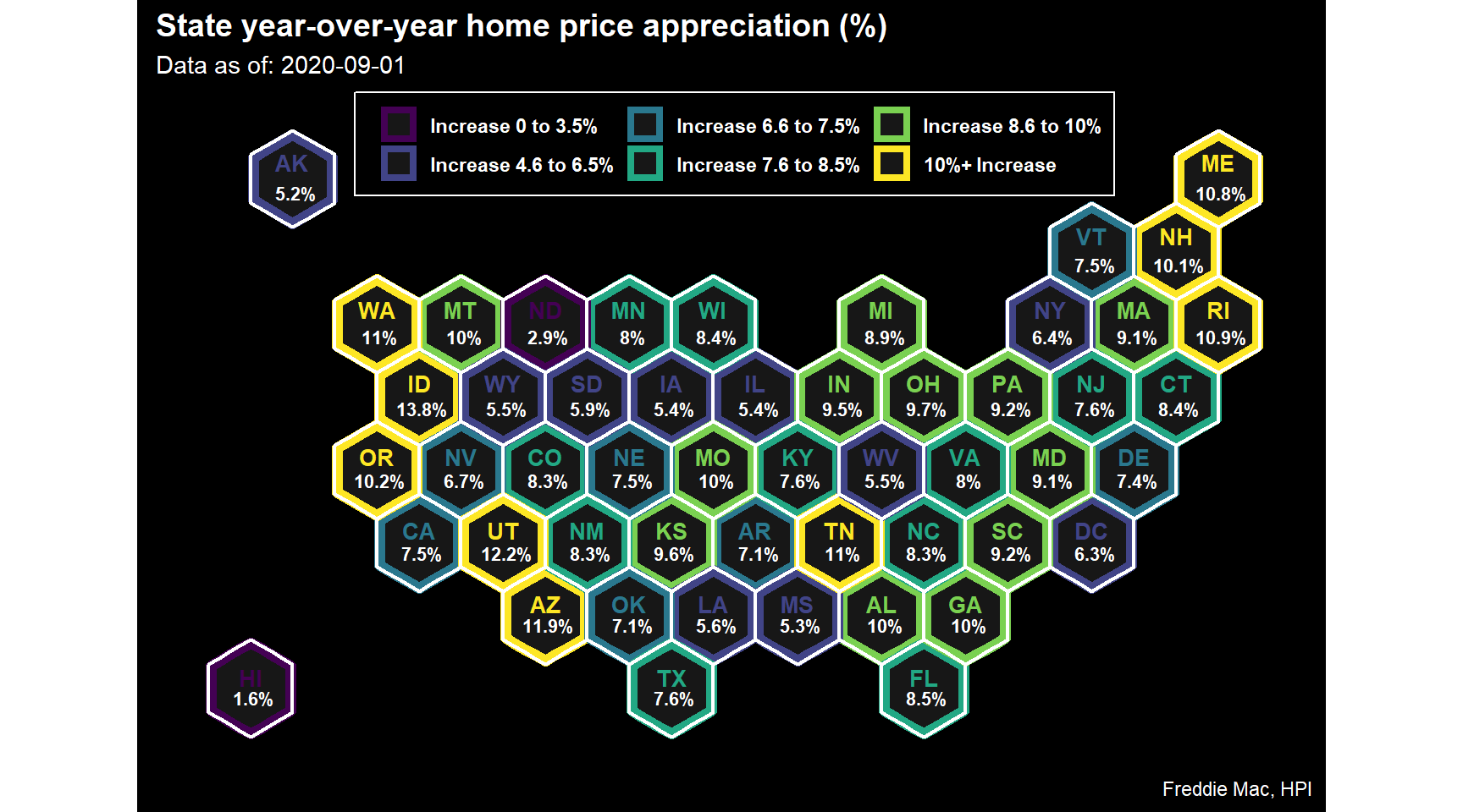
Conclusions
This vizualization implies continued upward pressure on home prices in aggregate. As previously discussed, the key driver of this upward trend remains to be: (i) low interest rates; (ii) limited supply (listings of for sale properties). Next post, we’ll look at graphing demographics for a sense of impact on how this potentially contributes to increased demand (while supply remains low).
For context, the historicaly (pre-2007) average year-over-year home price was 2.5 - 3.5% (after adjusting for inflation). Assuming a 2% rate of inflation (though it has been much lower recently), any state with a year-over-year rate > 5.0% would indiciate a higher appreciation than average appreciation. Currently, only North Dakota and Hawaii are experiencing levels below historic averages. These recent results may be indicative of increased Covid cases (ND) and reduced investment purchases (HI), but are worth watching for those particular states.