U.S. Unemployment by State
if(!require(pacman)){
  install.packages("pacman")
  require(pacman)
}


p_load(tidyverse, tidyquant, stringr,
       lubridate, purrr, lubridate,
        tigris, geofacet, ggrepel, ggdark, knitr)
About the data and R packages
The U.S. Bureau of Labor Statistics (BLS) tracks monthly unemployment rate(s). Given the frequency of reporting, these figures are generally smoothed over multiple months. Federal policy making offers programs, but these figures can largely be driven by state, county and local economies.
Due to Covid-19, the unemployment rate spiked dramtically across the United States. In order to track the recovery at a state specific level, I have built a map which utilizes BLS data.
The workhorse R packages here include: tidyquant (FRED2 API), geofacet (map visual) and ggdark for thematic coloring/styling of the plot.
Get the data
- Tigris package to get all state abbreviations from the U.S. Census Bureau
- tidyquant::tq_get for sourcing all states from Federal Reserve Economic Data (FRED2)
# Get all state abbreviations and then concatenate with standardized
# Fred2 ticker

st_abb <- tigris::fips_codes%>%
  group_by(state)%>%
  filter(row_number()==1)%>%
  filter(!state %in% c("AS", "GU", "MP", "PR", "UM", "VI"))%>%
  select(state)%>%
  pull(.)

tks <- c(paste0(st_abb, "UR"))


# Pass tickets to tidyquant API wrapper for Fred2
# **Note this pulls a lot of data. Montly data by state since 2005
d_ue <- tidyquant::tq_get(tks, get = "economic.data", from = "2005-01-01")%>%
  mutate(st_abb = str_sub(symbol,0,2))


# Get nat'l figures for reference, relative to state UE
d_natl <- tq_get("UNRATE", get = "economic.data", from = "2020-01-01")%>%
  mutate(dt_yr = year(date)%>%as.character())%>%
  rename(natl_rate = price)

curr_natl_ue <- d_natl%>%
  slice(which.max(date))
Plot data as a time-series map
Utilizing geofacets we will create a rendering of the U.S. with each state’s specific unemployment rate over time.
We will first capture the most recent observation by state to include coloring and the value for that period.
recent_obs <- d_ue%>%
  group_by(st_abb)%>%
  slice(which.max(date))


p1 <- d_ue%>%
  ggplot()+
  geom_line(aes(x = date, y = price))+
  geom_point(data = recent_obs,
             aes(x = date, y = price),
             color = "darkred", size = 2.25, alpha = .8)+
  ggrepel::geom_text_repel(data = recent_obs,
                           aes(x = date, y = price, label = paste0(price, "%")),
                           vjust = -1)+
  scale_x_date(date_breaks = "4 years",
               labels = function(x) paste0("'",str_sub(x,3,4)))+
  labs(title = "The current state of unemployment in the U.S.",
       subtitle = paste("Data as of:", first(recent_obs$date)%>%format(., "%b-%Y")),
       caption = "Bureau of Labor Statistics",
       x = NULL,
       y = NULL)+
  ggdark::dark_theme_classic()+
  geofacet::facet_geo(~st_abb, grid = "us_state_grid2")+
  theme(axis.text.y = element_blank(),
        axis.ticks.y = element_blank())


p1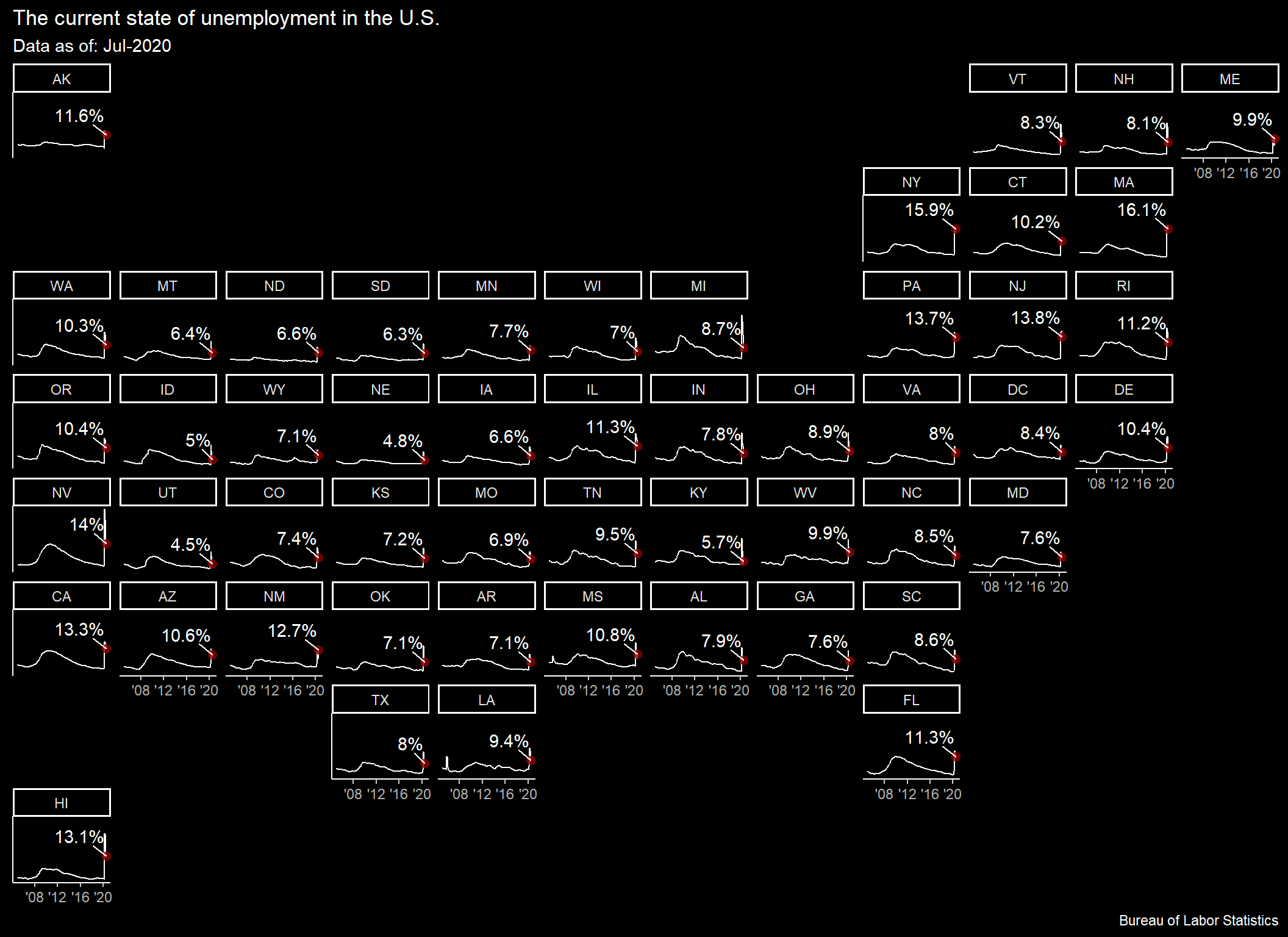
Conclusions
Many states have pulled below the national unemployment rate, however, the national rate remains elevated relative to historic/non-recessionary periods. This will continue to cause an impact and remain a drain on the broader economy without further stimulus or jobs programs.
curr_natl_ue%>%
  select(`Last Reported`= date, `Nat'l UE Rate (%)` = natl_rate)%>%
knitr::kable(align = "c")| Last Reported | Nat’l UE Rate (%) |
|---|---|
| 2020-07-01 | 10.2 |