Mortgage Rates
The cost to borrow for purchasing a new mortgage or refinancing the terms of an existing mortgage continues to remain at historic lows.
The positive side is existing homeowners continue to be in-the-money to refinance under beneficial terms (assuming they have not experienced an employment disruption, loss in assets) and new prospective homeowners can anticipate lower monthly payments given rates.
About the Data
For this post, we’ll look at the Freddie Mac Primary Mortgage Market Survey (PMMS), which produces a national average view of lenders (or Freddie Mac sellers) closing interest rates.
This is a lengthy time-series that is reported on a weekly basis. In order to view the larger picture we’ll use a simple monthly average to see how rates have trended over time.
if(!require(pacman)){
  install.packages("pacman")
  require(pacman)
}

p_load(tidyquant, tidyverse, fs, tools, lubridate, scales, janitor, purrr, tidyr, RColorBrewer, readxl, readr, knitr)

tks_rates <- "MORTGAGE30US"
Load Mortgage Rate Data
Similar to previous posts, we’ll utilize tidyquant’s wrapper of the FRED2 api in order to pull in the weekly data from 2000 to the most recent period. Next, we’ll create more comprehensive dates and then aggregate the data to monthly averages for each year.
We add an additional coloring column, which will be utilized in the plot section for the text displayed in our “geom_tile” chart.
d_rates <- tq_get(tks_rates,
                  from = "2000-01-01",
                  get = "economic.data")

d_prep <- d_rates%>%
  mutate(dt_year = year(date),
         dt_month = month(date),
         mo_abb = as_factor(month.abb[dt_month]))%>%
  group_by(dt_year, mo_abb)%>%
  summarize(avg_rates = round(mean(price, na.rm = T), 2))%>%
  ungroup()%>%
  mutate(col_txt = ifelse(avg_rates < 5.01, "black", "white"))
Visualize Historic Mortgage Data in Tiles
An interesting way to view time-series data is within a grid/tile format where we can observe data across year and month. Addiional detail is provided by rendering the value by color and finally adding the text of the value to quickly confirm any findings.
This type of plot is more visually appealing, but the downside is it is harder to immediately analyze the long run trend of mortgage rates relative to historic averages. Sometimes a simple line chart does just the trick.
cap_data_through <- d_rates%>%
  slice(which.max(date))%>%
  select(date)%>%
  pull(.)%>%
  as.character(.)


p1 <- ggplot(d_prep, aes(x = mo_abb, y = dt_year, fill = avg_rates))+
  # geom_raster(vjust = 0, hjust = 0, color = "white", na.rm = T)+
  geom_tile(color = "white", na.rm = T, hjust =0, vjust = 0)+
  geom_text(aes(label = avg_rates, color = col_txt),
            fontface = "bold")+
  scale_color_manual(values = c( "black", "white"))+
  scale_y_continuous(breaks = seq(2000, 2020, 1), expand = c(0,0))+
  scale_x_discrete(position = "top", expand = c(0,0))+
  scale_fill_viridis_c(option = "A", direction = -1)+
  coord_equal(ratio = 1)+
  labs(title = "Average monthly mortgage rates by month (30-Yr Fixed Rate Mortgage)",
       subtitle = "Freddie Mac, Primary Mortgage Market Survey (PMMS)",
       x = NULL,
       y = NULL)+
  theme_minimal()+
  theme(legend.position = "none",
        plot.margin = unit(c(0, 0, 0, 0), "cm"),
        panel.grid = element_blank(),
        axis.text.x = element_text(face = "bold", vjust = 2))

p1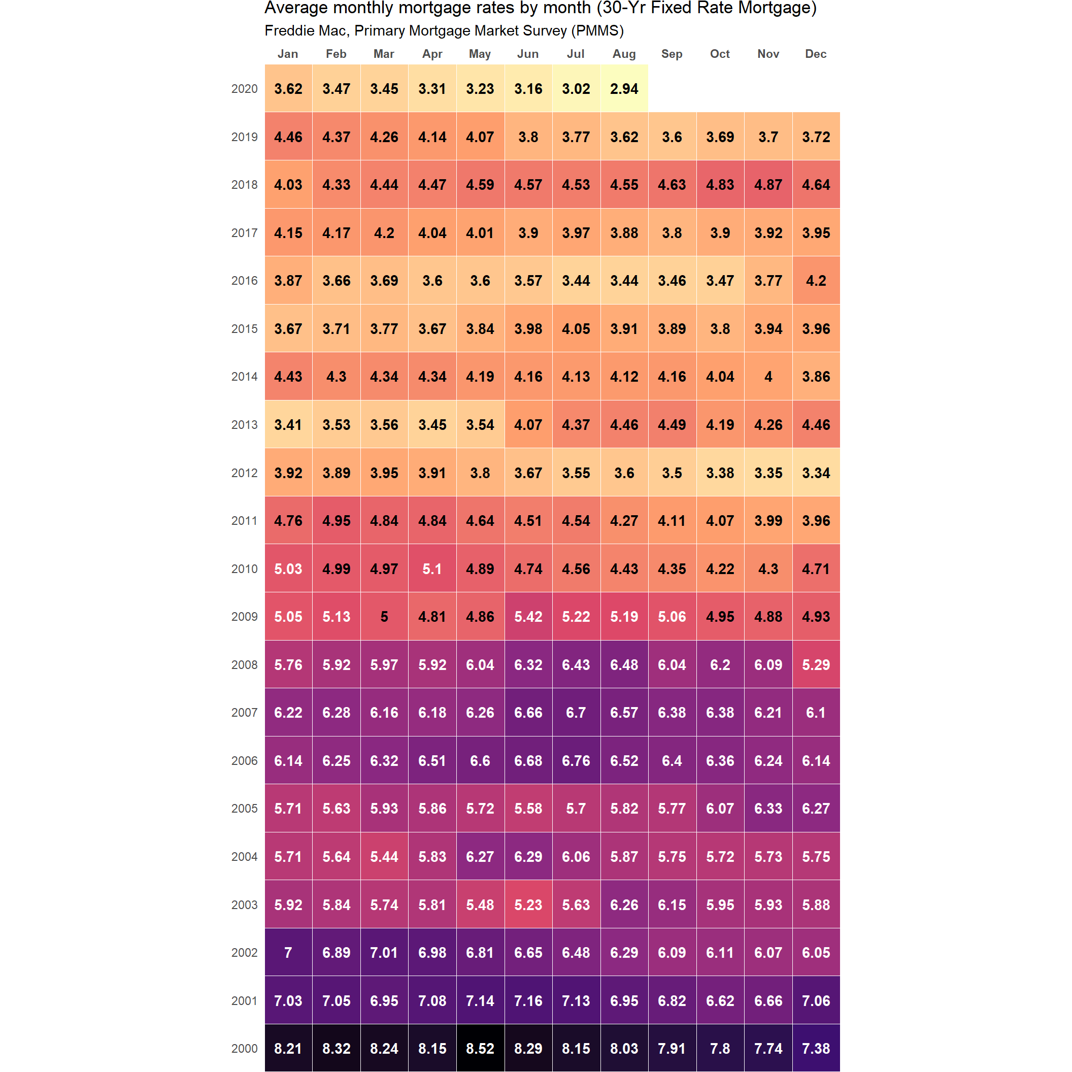
Bonus - Revisit Freddie Mac Quarterly Refinance Report
In an earlier post we described another interesting source of data specific to refinancing mortgages by type of refinance. At the time of writing the post in late 2018, we had observed that Cash-out-Refinances appeared to be at an all time high.
Given the trend in rates moving further lower and many existing borrowers having already extracted equity (cash-out) of their homes – we would expect two trends from more recent Freddie Mac data.
- We would expect a lower proportion of Cash-out refinance activity
- In Freddie’s dataset this would be a decline in 5% Higher Loan Amount
- In our dataset we re-title this to: cash_out_pct
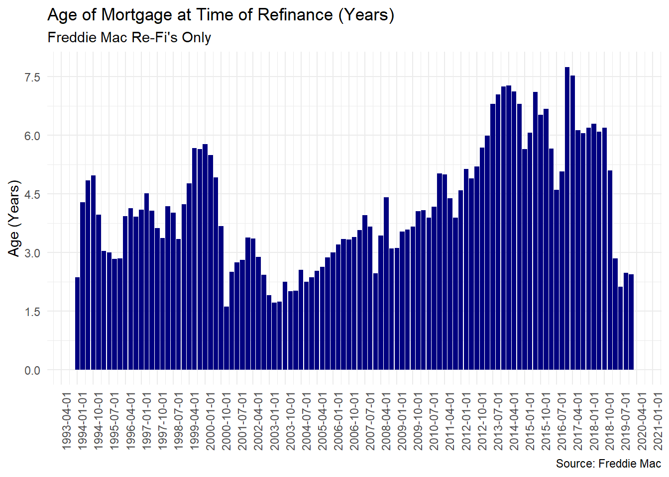
- If borrowers continued to refinance given lower rates, we would expect that the age of loans when being refinanced to have declined as well
- In Freddie’s dataset this would be a decline in Median Age of Refinanced Loan (years)
- In our dataset we re-title this to: median_age_refi
A note on code adjustments
I have adjusted the url for the report and the function below from our original post to accommodate minor changes within the report structure from Freddie.
fre_refi_url <- "http://www.freddiemac.com/fmac-resources/research/docs/q1_refinance_2020.xls"


# Function:
get_fre_qtr_refi <- function(fre_refi_url){

  fre_col_nms <- c("dt_qtr_yr", "cash_out_pct", "no_chng_pct", "lower_loan_amt_pct",
                 "median_ratio_new_old", "median_age_refi", "median_hpa_refi")
  if(missing(fre_refi_url)){
    base_fre_refi_url <- "http://www.freddiemac.com/research/datasets/refinance-stats/"
    paste0("Find the most recent dataset here: ", base_fre_refi_url)
  }else{

   fre_refi_url <- "http://www.freddiemac.com/fmac-resources/research/docs/q1_refinance_2020.xls"


tf <- tempfile()
download.file(fre_refi_url, tf, mode = "wb")
file.rename(tf, paste0(tf, ".xls"))

d_fre <- read_excel(paste0(tf, ".xls"), skip = 5, sheet = 1)%>%
  select(-contains("..."), -contains("memo"))%>%
  setNames(., fre_col_nms)%>%
  na.omit()


st_dt_yr <- str_sub(d_fre$dt_qtr_yr, 0, 4)%>%head(.,1)%>%as.numeric()
st_dt_qtr <- str_sub(d_fre$dt_qtr_yr, -2)%>%
  head(.,1)%>%
  as.numeric()%>%
  ifelse(. == 1, ., (.*3)+1)

end_dt_yr <- str_sub(d_fre$dt_qtr_yr, 0, 4)%>%tail(.,1)%>%as.numeric()
end_dt_qtr <- str_sub(d_fre$dt_qtr_yr, -2)%>%
  tail(.,1)%>%
  as.numeric()%>%
  ifelse(. == 1, ., (.*3)+1)

seq_dt <- seq(ymd(paste(st_dt_yr, st_dt_qtr, "01", collapse = "-")),
              ymd(paste(end_dt_yr, end_dt_qtr, "01", collapse = "-")),
              by = "quarter")

d_fre <- d_fre%>%
  mutate(dt_full = seq_dt)
  }
  unlink(tf)
  return(d_fre)
}
In addition, I have refactored the code below from the original post to reflect changes made to tidyr. Rather than tidyr::gather, we utilize tidyr::pivot_longer to convert our data to a long format from wide prior to plotting.
d_refi <- get_fre_qtr_refi(fre_refi_url)

d_refi_long <- d_refi%>%
  select(dt_full, contains("pct"))%>%
  pivot_longer(., names_to = "refi_type", values_to = "value", -dt_full)%>%
  mutate(refi_type_f = factor(refi_type, levels = rev(c("cash_out_pct","lower_loan_amt_pct", "no_chng_pct")),
                              labels = rev(c("Cash-Out", "Lower Loan Amount", "No Change")), ordered = T))


t_cashout_pct <- select(d_refi, dt_full, cash_out_pct, median_age_refi)%>%
  filter(dt_full ==  "2018-07-01" | dt_full == max(dt_full))%>%
  mutate(`% Cashout Refi` = paste0(round(cash_out_pct*100,2), "%"),
         `Age of Mortgage Refi (Years)`=round(median_age_refi, 2))%>%
  select(DateFull = dt_full, `% Cashout Refi` ,
         `Age of Mortgage Refi (Years)`)
Checking Refi Trends and Next Steps
- The proportion of cash-out refinances has been nearly halved since our initial post.
- The median age of mortgage in years at point of refinance has also declined by over half the original age from our earlier data.
There are a number of reasons/uses for taking cash/equity out of your home. One of the most commmon reasons is for remodeling your home. Next we’ll look at some measures/metrics around construction and remodeling to see how those are faring.
t_cashout_pct%>%
kable(., align = "c", )| DateFull | % Cashout Refi | Age of Mortgage Refi (Years) |
|---|---|---|
| 2018-07-01 | 81.42% | 6.09 |
| 2020-01-01 | 42.13% | 2.44 |
ggplot(data = d_refi_long)+
  geom_area(aes(x = dt_full, y = value, fill = refi_type_f))+
  scale_y_continuous(label = percent)+
  scale_fill_viridis_d("")+
  labs(title = "Quarterly Refinance by Type",
       subtitle = "Freddie Mac Re-Fi's Only",
       x = NULL,
       y = "Percent Type (%)",
       caption = "Source: Freddie Mac")+
  theme_minimal()+
  theme(legend.position = "top")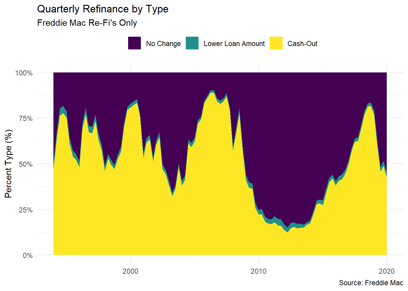
d_refi%>%
  select(dt_full, median_age_refi)%>%
  ggplot()+
  geom_bar(stat = "identity",
           aes(x = dt_full, y = median_age_refi),
           fill = "navy")+
  scale_x_date(breaks = date_breaks("9 months"))+
  scale_y_continuous(breaks = seq(0,8,1.5))+
  labs(title = "Age of Mortgage at Time of Refinance (Years)",
       subtitle = "Freddie Mac Re-Fi's Only",
       x= NULL,
       y = "Age (Years)",
       caption = "Source: Freddie Mac")+
  theme_minimal()+
  theme(axis.text.x = element_text(angle = 90))