TidyTuesday Plot
If you readers are not familiar with TidyTuesday…it is a weekly posting of a dataset to allow new and experienced users to flex their skills with R. The data is provided as-is and is meant to allow users to continue to sharpen their skills.
There are a variety of different data sources for any and all users looking to explore new packages, enhance their skills or show off what they have learned to a broader audience.
Since the administrators produce extensive descriptions and sources of the data for reproducible, we’ll keep these posts brief. In addition, they have created a package a package for consuming data in an automated fashion on a weekly basis.
Year: 2020
Week: 09
Dataset: Vaccinations for select schools within the United States
Pull in the data
First we’ll pull in the data and create some quick summary tables which can be found at the bottom of this post for reference.
# LOAD DATA
#--------------------------------------------------------
dt_yr <- year(Sys.Date())
dt_wk_no <- week(Sys.Date())

# Read in data which takes the year and week number
d_in <- tidytuesdayR::tt_load(dt_yr, dt_wk_no)%>%.$measles

# Without setting the data as a variable, a viewer panel will bring up the site details
# This includes a data dictionary and source of data
tidytuesdayR::tt_load(dt_yr, dt_wk_no)

# INSPECT DATA
#------------------------------------------------------------

t1 <- map_df(d_in, ~length(unique(.)))%>%
  gather(variable, value)%>%
  kable(., caption = "Unique Values", format.args = list(big.mark = ","), format = "html")

t2 <- map_df(d_in, ~sum(is.na(.)))%>%
  gather(variable, value)%>%
  kable(., caption = "Number of NA's", format.args = list(big.mark = ","), format = "html")

t3 <- d_in%>%
  select_if(is.numeric)%>%
  map_df(., ~range(., na.rm=T))%>%
  gather(variable, value)%>%
  group_by(variable)%>%
  mutate(row_id = row_number())%>%
  ungroup()%>%
  mutate(variable_cat = ifelse(row_id==1, paste0(variable, "_lo"), paste0(variable, "_hi")))%>%
  select(-c(row_id, variable))%>%
  select(variable_cat, value)%>%
  kable(., caption = "Range of Numerics", format = "html")
Clean and join data
We’ll download a few reference spatial files to build out the robustness of the dataset. Then we’ll do a quick viz to understand how we would like to build a plot for the data. Since the TidyTuesday data is in a tidy format, we will need to convert the lat / lng columns to sf for our final plot.
# 1. Get School District Geom from U.S. Census

d_wa_school <- tigris::school_districts(state = "WA", year = 2018)
# glimpse(d_in)

# 2. Convet df to sf object so we have lat long we can compare against Census

d_tt_geo_wa <- d_in%>%
  filter(state == "Washington")%>%
  filter_at(vars(lat, lng), ~any(is.na(.)))%>%
  mutate_at(vars(lat, lng), ~as.numeric(.))%>%
  st_as_sf(
    coords = c("lng", "lat"),
    agr = "constant",
    crs = st_crs(d_wa_school),
    stringsAsFactors = F,
    remove = T,
    na.fail = F)%>%
  mutate(overall = ifelse(overall < 0, 0, overall))


# 3. Get which school points are within which district
dc_geo_wa <- st_join(d_tt_geo_wa, d_wa_school, join = st_within)%>%
  mutate(district = NAME)

# 4. Get WA state outline geometry, where 53  = WA state fips2 state code

d_wa <- tigris::states(cb = T)%>%
  filter(STATEFP == "53")


p1 <- ggplot(d_tt_geo_wa, aes(x = county, y = overall))+
  ggbeeswarm::geom_quasirandom(aes(color = county), groupOnX = F)+
  scale_color_viridis_d("")+
  coord_flip()+
  labs(title = "Total vaccinations by county",
       x = NULL,
       y = "Overall Vaccinated (%)")+
  theme_minimal()+
  theme(legend.position = "none")


p1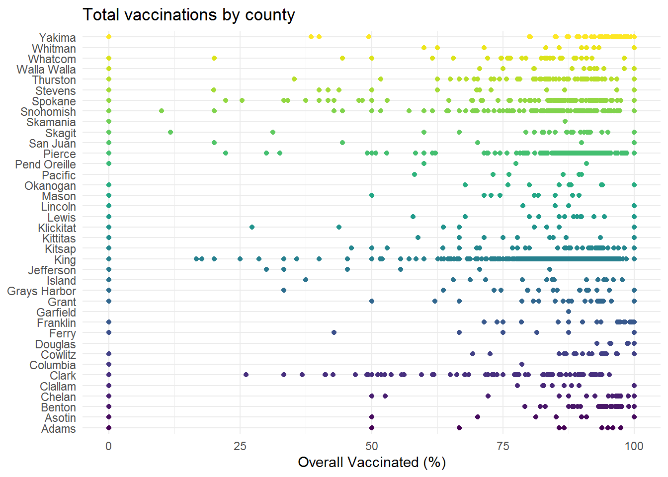
Our plot
Since there are quite a few gaps within the dataset, we will focus on attempting to build a map of median vaccination percent by Washington state school district. Note that we are note keeping a tally, but for clarity – the lower of the overall vaccination should be interpreted as higher potential risk and higher values on the y-axis as an indication of a higher percent of students receiving common vaccinations.
Our geometry layers will be:
State outline for WA (U.S. Census)
Add borders for individual school districts (U.S. Census)
Map points of individual schools reported in the TidyTuesday dataset
3.1. Facet the plot based on the overall reported vaccination proportion in the dataset
# Create a base theme for our map
theme_map_sq <- function(...){
  theme_minimal()+
    theme(
      title = element_text(family = "Arial", color = "white"),
      axis.line = element_blank(),
      axis.text.x = element_blank(),
      axis.text.y = element_blank(),
      axis.ticks = element_blank(),
      axis.title.x = element_blank(),
      axis.title.y = element_blank(),
      # panel.grid.minor = element_line(color = "#ebebe5", size = 0.2),
      panel.grid.major = element_blank(),
      panel.grid.minor = element_blank(),
      plot.background = element_rect(fill = "#000000", color = NA),
      panel.background = element_rect(fill = "#000000", color = NA),
      panel.border = element_blank(),
      ...
    )
}

# Create breaks for our facet based on observations from our data
cln_brks <- c(0, 30, 65, 75, 80, 85, 90, 95, 100)

# Create our median aggregation of overall vaccination levels
# We also do some text cleaning of our breaks for better facet labels

d_agg <- dc_geo_wa%>%
  select(index, st_name = state, school_name = name, fips2 = STATEFP,
        cens_geoid = GEOID, cens_dist_name = NAME, city, county,
        enroll, overall, xrel, xmed, xper, geometry)%>%
  group_by(cens_dist_name)%>%
  summarize(median_overall = median(overall, na.rm = T))%>%
  ungroup()%>%
  mutate(geometry = st_cast(geometry, "POINT"),
         brk_facet = cut(median_overall, breaks = cln_brks),
         brk_facet = str_replace_all(brk_facet, pattern = "\\(|\\]", ""),
         brk_facet = str_replace_all(brk_facet, pattern = "\\,", " to "))%>%
  na.omit()


p2 <- ggplot()+
  geom_sf(data = d_wa, fill = "#000000", color = "white", alpha = 0.85)+
  geom_sf(data = d_wa_school, fill = "#000000", color = "white", alpha = .85)+
  geom_sf(data = d_agg, aes(geometry = st_jitter(geometry, factor = 0.01)),
          size = 2, color = "darkred", fill = "darkred")+
  labs(title = "Overall vaccination rates by school district",
       subtitle = "United States, Washington State (2018-2019)",
       caption = "Date: TidyTuesday, 2020, Wk = 9",
       x = NULL,
       y = NULL)+
  facet_wrap(~brk_facet)+
  theme_map_sq()+
  theme(legend.position = "none",
        strip.background = element_rect(fill = "white"),
        strip.text = element_text(face = "bold"))


p2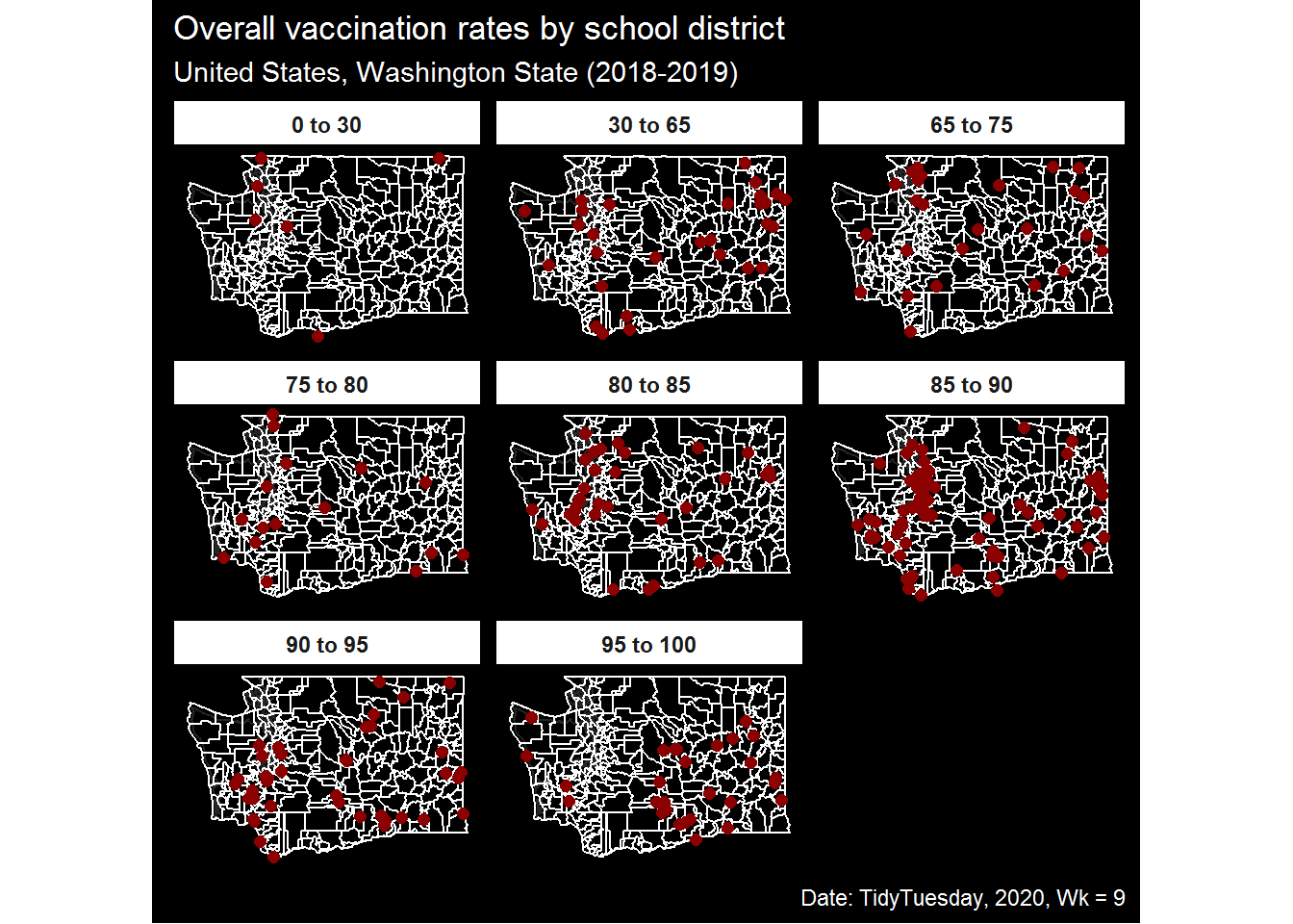
Reference: Data Inspection Tables
# Length of distinct variables
t1| variable | value |
|---|---|
| index | 8,066 |
| state | 32 |
| year | 4 |
| name | 36,129 |
| type | 7 |
| city | 5,666 |
| county | 1,159 |
| district | 1 |
| enroll | 967 |
| mmr | 4,796 |
| overall | 2,691 |
| xrel | 2 |
| xmed | 1,127 |
| xper | 1,592 |
| lat | 44,563 |
| lng | 44,546 |
# Number of NAs by variable
t2| variable | value |
|---|---|
| index | 0 |
| state | 0 |
| year | 0 |
| name | 0 |
| type | 36,622 |
| city | 20,071 |
| county | 6,254 |
| district | 66,113 |
| enroll | 16,260 |
| mmr | 0 |
| overall | 0 |
| xrel | 66,004 |
| xmed | 45,122 |
| xper | 57,560 |
| lat | 1,549 |
| lng | 1,549 |
# Range of integer variables

t3| variable_cat | value |
|---|---|
| index_lo | 1.00000 |
| index_hi | 8066.00000 |
| enroll_lo | 0.00000 |
| enroll_hi | 6222.00000 |
| mmr_lo | -1.00000 |
| mmr_hi | 100.00000 |
| overall_lo | -1.00000 |
| overall_hi | 100.00000 |
| xmed_lo | 0.04000 |
| xmed_hi | 100.00000 |
| xper_lo | 0.17000 |
| xper_hi | 169.23000 |
| lat_lo | 24.55327 |
| lat_hi | 48.99995 |
| lng_lo | -124.49686 |
| lng_hi | 80.20515 |