Growth Strategy Progress
In a previous post, we provided background of Seattle’s comprehensive planning around urban growth within the city. Fortunately, Seattle has a robust open data plan so we can quickly recreate some of the maps introduced in the text with the most recent data published.
In order to complete this analysis we will be predominately using three packages within R to complete the mapping exercise.
- tidycensus, tigris = General geographic data
- sfc = Formatting, projecting and data type (simple features)
- leaflet = An R API wrapper of JS leaflet for building our interactive map
The utilization of geographic data is highly technical and there is a lot of nuance that I will not explore in detail for this post. Where possible, I have added linked references so one can dig as deep as they wish to go on varying concepts.
Steps for Analysis
We will follow our normal process with a few additional steps for managing our geo data.
- Load Seattle city data and our geography files from U.S. Census
- Clean-up geography data so we have consistent projections and the appropriate bounds of data
- Clip geo data sources
- Compare visuals of geo data to observe differences in clipping methods
- Join data together to ensure we have the appropriate geography data and measures
- Create an interactive leaflet map that includes pop-ups of progress to date as reported by Seattle
Load data
We will load three different data sets to conduct our analysis: 1. State data from the U.S. Census 2. Municipal boundary data from Washington state 3. Seattle planning data on progress aggregated from multiple sources (includes geometry)
A listing of the available non-census data sets (WA / Seattle data sets) can be found here.
NOTE: We will want to ensure all of our data our in compatible data types and projections. This requires setting our options for tigris package at the outset AND aligning the crs data with sf::st_crs function
#Note: Add results="hide" to avoid printing download progress of tigris data...

# Option setting mentioned above to convert tigris to sf
options(tigris_class = "sf")

# URLS for data:
muni_boundary <- "https://opendata.arcgis.com/datasets/d508083ebd7d444b9997639af845937d_1.geojson"
url_vlg_boundary <- "https://opendata.arcgis.com/datasets/9267e111804b4cc7b44bc73c673e6bda_0.geojson"


# Load data into environment

## 1. WA State Tract Level Geometry using Tigris (no link required)
d_wa_tract <- tracts(state = "WA", cb = T)%>%suppressMessages()

## 2. Load municipal boundaries for Seattle, note we set the crs = to our tigris tract dataset

d_sea_muni <- geojson_sf(muni_boundary)%>%
  filter(., CITYNAME == "Seattle")%>%
  st_transform(., st_crs(d_wa_tract), "+no_defs +datum=WGS84 +proj=longlat")


## 3. Finally we get our dataset from City of Seattle with the planning measures

d_vlg_designations <- geojson_sf(url_vlg_boundary)%>%
  st_transform(., st_crs(d_wa_tract), "+no_defs +datum=WGS84 +proj=longlat")
Clip Datasets and Explore
Next we will take the 3 different data sets and clip the geographies to explore what they look like and which one process is the most accurate.
- View what the WA Tract data looks like from U.S. Census, we’ll see we only want a subset of the data
- Simple Clip: Clip the tract data based on the boundaries set out in the municipal data set
- Advanced Clip: Use sf::st_within to get Washington tracts within bounding box, then use true v. false (index) logic to subset the observations within the tract dataset.
# 2. Simple clip
d_clip1 <- d_wa_tract[d_sea_muni,]

# 3. Advanced Clip

d_inter <- st_within(d_wa_tract, d_sea_muni)
d_idx <- map_lgl(d_inter, function(x) {
  if (length(x) == 1) {
    return(TRUE)
  } else {
    return(FALSE)
  }
})

d_clip_adv2 <- d_wa_tract[d_idx,]


# Compare maps #1 WA State Tract; #2 Simple Clip; #3 Adv. Clip

ggplot(d_wa_tract)+
  geom_sf()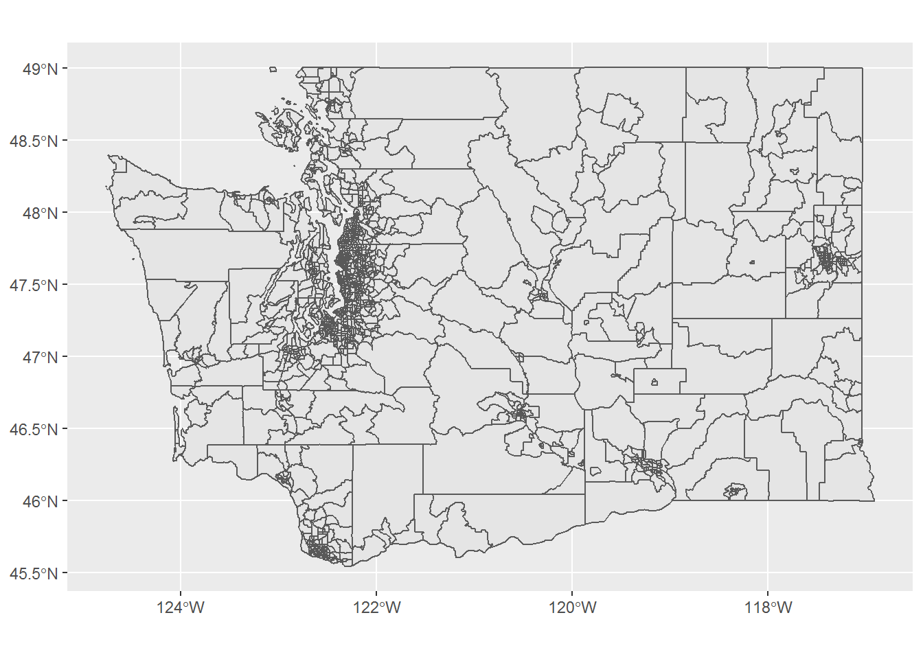
ggplot()+
  geom_sf(data = d_clip1)+
  geom_sf(data = d_vlg_designations, color = "darkred")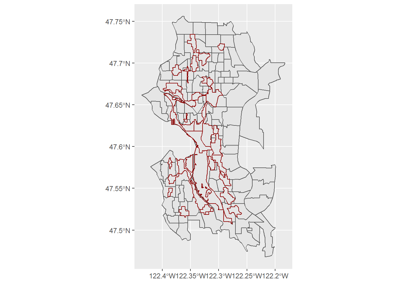
ggplot()+
  geom_sf(data = d_clip_adv2)+
  geom_sf(data = d_vlg_designations, color = "darkred")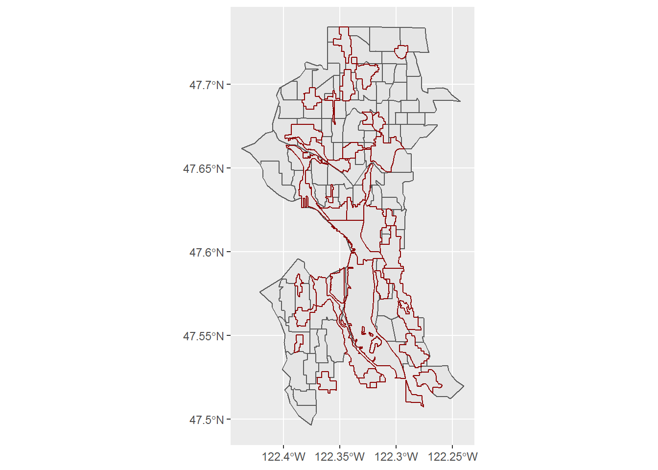
We see that the advanced clipping process creates a more tailored dataset that is a more accurate and skinny outline of the city of Seattle. Moreover, we see the boundary projections from our city planning dataset are more compatible with the clipping. Therefore, we’ll proceed with that data set for our mapping.
Map Dataset
In order to visualize our data we’ll plot select features on our interactive map. We will utilize the leaflet package, which allows for us to add layers to the plot for the results we desire.
- Set bounding box or boundaries of the plot area so our focus is only on Seattle
- Set a color palette for a specific value within the data set
- Create popup text that we will pass to our map to appear on selecting a colored geography
- Create the plot with each of the layers
# Gather bounding box details from our advanced clip go data
box_max <- d_clip_adv2%>%
  st_bbox()%>%
  as.vector()

# Create a color palette based off of the type of Seattle designated geographies

col_pal <- colorFactor("Blues", domain = d_vlg_designations$TYPE_NAME, reverse = T)

# Build the text of our pop-up when we select a given geography
# This utilizes htmltools

popup <- paste('<b>Name:</b>', d_vlg_designations$UV_NAME, '<br>',
               '<b>Type:</b>', d_vlg_designations$TYPE_NAME,'<br>',
               '<b>Equity Category:</b>', d_vlg_designations$EQUITY_CATEGORY, '<br>',
               '<b>Hunits Built Since 2015: </b>',
                prettyNum(d_vlg_designations$HU_BUILT_SINCE_15, big.mark=","), '<br>',
               '<b>Hunits Target Total 2015-35:</b>',
                prettyNum(d_vlg_designations$HU_TARGET_15_35, big.mark=","), '<br>',
               '<b>Hunits Remaining:</b>',
                prettyNum(d_vlg_designations$REMAIN_HU_TARGET, big.mark=","), '<br>')

m <- leaflet(d_vlg_designations)%>%
  addProviderTiles('CartoDB.DarkMatter')%>%
  fitBounds(box_max[1], box_max[2], box_max[3], box_max[4])%>%
  addPolygons(data = d_clip_adv2, stroke = 0.7, weight = 0.5, color = "white",
              opacity = 0.8,
              fillOpacity = 0.05)%>%
  addPolygons(data = d_vlg_designations,
              color = ~col_pal(TYPE_NAME),
              stroke = F,
              fillOpacity = 0.85,
              popup = ~popup,
              highlightOptions = highlightOptions(
                stroke = 0.5,
                weight = 1,
                color = "white",
                bringToFront = T)
  )%>%
  addLegend(map = ., pal = col_pal,
            values = ~TYPE_NAME, position = "bottomright",
            title = "Region Designation")

m
Conclusions
This offers us a great path to quickly viewing a number of different measures visually within the context of the City at a high degree of granularity. However, it implies an understanding of the underlying definitions and component measures to understand the results outlined in the initial 2012 analysis.
In our next post, we’ll explore a few more simplistic measures that can help quantify the success or inadequacies of the planning policies. This will not give us the localized degree of understanding, but will at least inform whether the desired outcomes are being attained. We’ll utilize: available housing inventory, home prices and average mortgage payment under a vanilla 30-yr fixed-rate mortgage over time to determine whether (or perhaps why), we see the results we do within the map.