Summary Background (About the Data)
The homeownership rate within the U.S. is a metric closely followed by industry professionals and economists as an indicator of robustness of the housing sector. The U.S. Census Bureau produces a number of survey instruments in an attempt to better understand demographic, population, social and economic trends over long periods of time. The most well known survey is the decennial Census, but the Bureau produces a number of more frequent estimates and adjustments throughout the year since the currency of 10-year data is not always helpful in gathering a current snapshot.
There are a number of different surveys used by economists to evaluate the number of households, tenure choice, occupancy and housing characteristics. Each of these surveys differ in method/design. Despite ongoing debates as to the accuracy and discrepencies between these surveys, more data to allow for these debates is better than none whatsoever. For this analysis we will be using one of the most commonly media cited measures, the Current Population Survey/Housing Vacancies and Homeownership (or the CPS/HVS).
The Housing Vacancies and Homeownership provides current information on the rental and homeowner vacancy rates, and characteristics of units available for occupancy. These data are used extensively by public and private sector organizations to evaluate the need for new housing programs and initiatives. In addition, the rental vacancy rate is a component of the index of leading economic indicators and is thereby used by the Federal Government and economic forecasters to gauge the current economic climate.
For this analysis, we will use the most recently published data reported in Q3-2018.
- Census Historical HVS Data Site
- Table 19 - Quarterly Homeownership Rates by Age of Householder
- Note the above link is a direct download of the Excel file
For readers attempting to reproduce this analysis, it will be assumed that you have already downloaded the file, cleaned it up (removed revisions/created full dates) and pointed your working directory to the file. A custom function I have written to expedite this process with R can be found here. Note that the working directory and the target download url may need to be updated for your own specific flow prior to execution of the script.
# rm(list = ls())
# Optional - don't treat strings as factors,
# no scientific notation for large #'s
options(stringsAsFactors = F, scipen = 99)

# Required Packages - install if necessary
# UPDATE TO INSTALL IF DON'T EXISt
pks <- c("ggplot2", "stringr", "tidyverse", "knitr",
         "lubridate", "fs", "purrr", "scales", "tidyr",
         "gridExtra", "grid", "kableExtra", "printr")

invisible(lapply(pks, require, character.only = T))


# Name of the file for reading in
fname <- "2018-10-30-HVS-Homeownership-Q32018.csv"
Load Data and Inspect Column Headers
Upon loading the data, we can quickly inspect the most recent readings from Q3-2018. The column headers below are as follows:
- full_dt = The quarter reported expressed as a full date
- variable = The Age of Householder cohort
- value = The percent of homeownership for the cohort
- ma_ann_right = The 4 quarter (annual) moving average of the homeownership rate (right weighted) for each cohort
# https://blogdown-demo.rbind.io/2018/02/27/r-file-paths/
# For reading in data with blogdown

d <- read_csv(paste0("../../static/data/",fname), col_names = T)%>%
  select(full_dt, variable, value, ma_ann_right)

# Get the most recent Homeownership Rate
# by Age of Householder
# We will use this for adding points
# to our plots in the next section
d_points <- group_by(d, variable)%>%
  slice(which.max(full_dt))

d_points%>%
  kable(., format = "html", align = "c")%>%
  kable_styling(bootstrap_options = "striped",
full_width = T, position = "center")| full_dt | variable | value | ma_ann_right |
|---|---|---|---|
| 2018-07-01 | 35_to_44_years | 59.5 | 59.550 |
| 2018-07-01 | 45_to_54_years | 69.7 | 69.950 |
| 2018-07-01 | 55_to_64_years | 75.6 | 75.350 |
| 2018-07-01 | 65_years_and_over | 78.6 | 78.575 |
| 2018-07-01 | national | 64.4 | 64.275 |
| 2018-07-01 | under_35_years | 36.8 | 36.150 |
Plot the Data
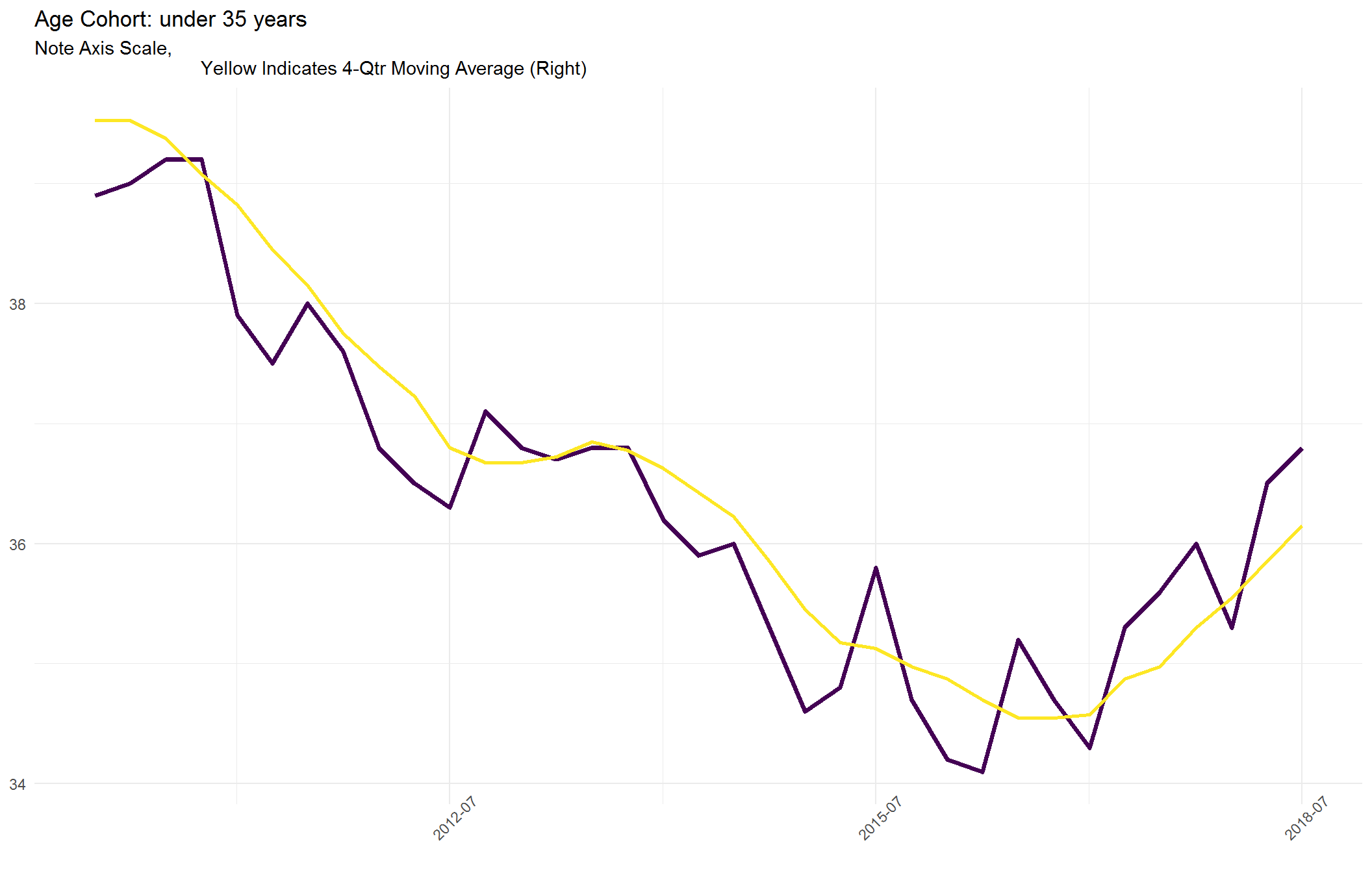
In general, we would expect to see the highest levels of homeownership for the elderly age cohorts, which is reflected in the plots below. However, the primary cohort of interest for most market observers is the Under 35 age cohort for a couple of reasons
- They represent the most populous age cohort
- Most elder cohorts represent “step-up” home purchases, not a substantial contributor to increases in the rate (i.e. net new homeowners)
- Historically, the average age for consumers purchasing their first home is 27 (i.e. moving from renters to homeowners)
- Their behavior and desire for homeownership has been debated given the financial crisis, stagnant wages and high home prices (reduced affordability) in urban areas
This should be viewed as a positive sign. Despite the expected downward trajectory resulting from the 2007 housing crisis, the rate has recently bottomed and is now moving upward nationally. By plotting can see this ascension at the national level has.
Note About the Code
There are a number of ways to make plots within R. The most flexible and seemingly widely used package is ggplot2. The plots we will create below use a combination of graphical packages, which include: ggplot2, grid and gridExtra. An alternative and more streamlined approach to the code below would be using ggplot::facet_wrap or ggplot:facet_grid. However, the method taken below allows for us more flexibility when saving the plots – providing the ability to save each Age Cohort graph in idually.
The steps we take below, generate six in idual plots grouped by age cohort (variable) as nested lists in a single column of a data frame. For a more detailed explanation of how the purrr and tidyr make this possible, please refer to Bruno Rodrigues’ more detailed post on the topic.
In short, we are grouping and nesting all of the data by age cohort and then we are using purrr:map2 to pass the data (data = .x) and the age cohort (variable = .y) to appropriately title of each of the plots. The color used for each line is taken from the col_ref variable we defined within the first chunk of this post.
One criticism of this graph, is that we are seemingly comparing a number of groupings whose graphs have different y-scaling which could be misleading.
# Colors used for ggplot2 below, Optional - Adjust as desired
col_ref <- c("#26828EFF", "#FDE725FF", "#440154FF")

# Creates the dataframe with a nested column containing each of the plots by
# Age Cohort

p_all <- d %>% group_by(variable) %>% nest() %>% mutate(plots_by_cohort = map2(data,
    variable, ~ggplot(data = .x) + geom_line(aes(x = full_dt, y = value), size = 1.25,
        color = col_ref[3]) + geom_line(aes(x = full_dt, y = ma_ann_right),
        size = 1, color = col_ref[2]) + scale_x_date(labels = date_format("%Y-%m"),
        breaks = date_breaks("36 months")) + theme_minimal() + theme(rect = element_rect(fill = "transparent"),
        title = element_text(size = 11), axis.text.x = element_text(angle = 45)) +
        labs(title = paste0("Age Cohort: ", str_replace_all(.y, pattern = "_",
            " ")), subtitle = "Note Axis Scale,
                                Yellow Indicates 4-Qtr Moving Average (Right)",
            x = NULL, y = NULL)))

# This first makes the 6 in idual plots using the purrr:invoke function Then
# we arrange each of these plots on a 2x3 with a title, caption and y-axis
# label for the grid (rather than for each in idividual plot)

invoke(grid.arrange, p_all$plots_by_cohort, top = textGrob("Homeownership Rate by Age of Householder",
    hjust = 0, x = 0, gp = gpar(fontface = "bold", fontsize = 14)), left = "Homeownership %",
    bottom = textGrob("U.S. Census, CPS/HVS", hjust = 1, x = 0.9, gp = gpar(fontface = "italic",
        fontsize = 8)))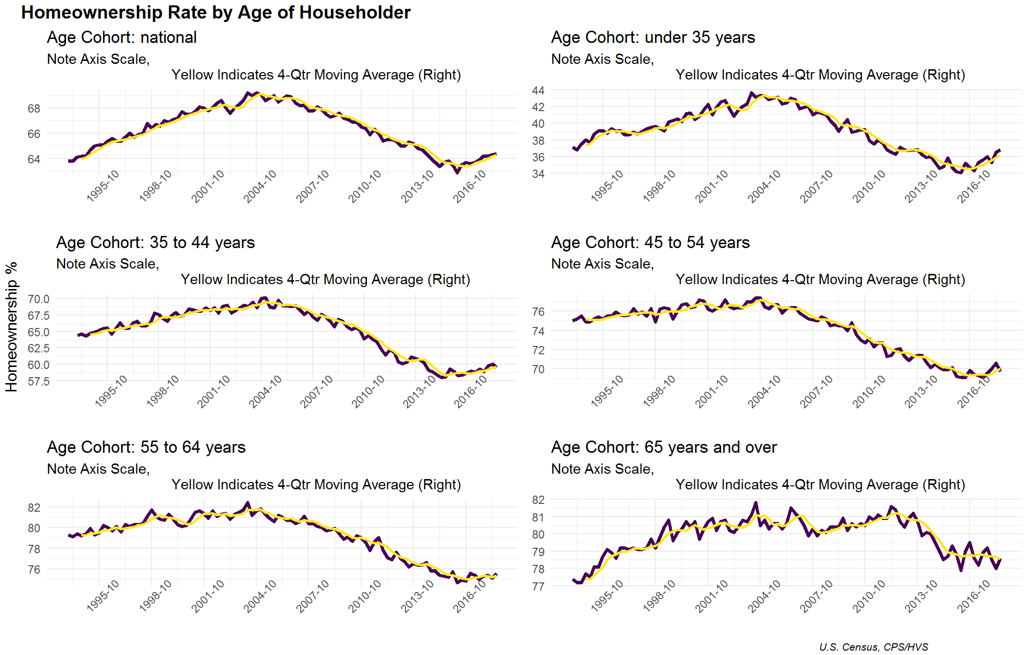
For a more detailed look, we will make a plot of just the National and <35 age cohort over a short time period.
p_subset <- p_all%>%
  filter(variable %in% c("national", "under_35_years"))%>%
  mutate(data_sub = map(data, ~filter(., year(full_dt) > 2009)),
         plots_by_cohort_sub = map2(plots_by_cohort, data_sub, ~.x%+%.y))

lapply(seq_along(p_subset$plots_by_cohort_sub),
       function(x) p_subset$plots_by_cohort_sub[[x]])
## [[1]]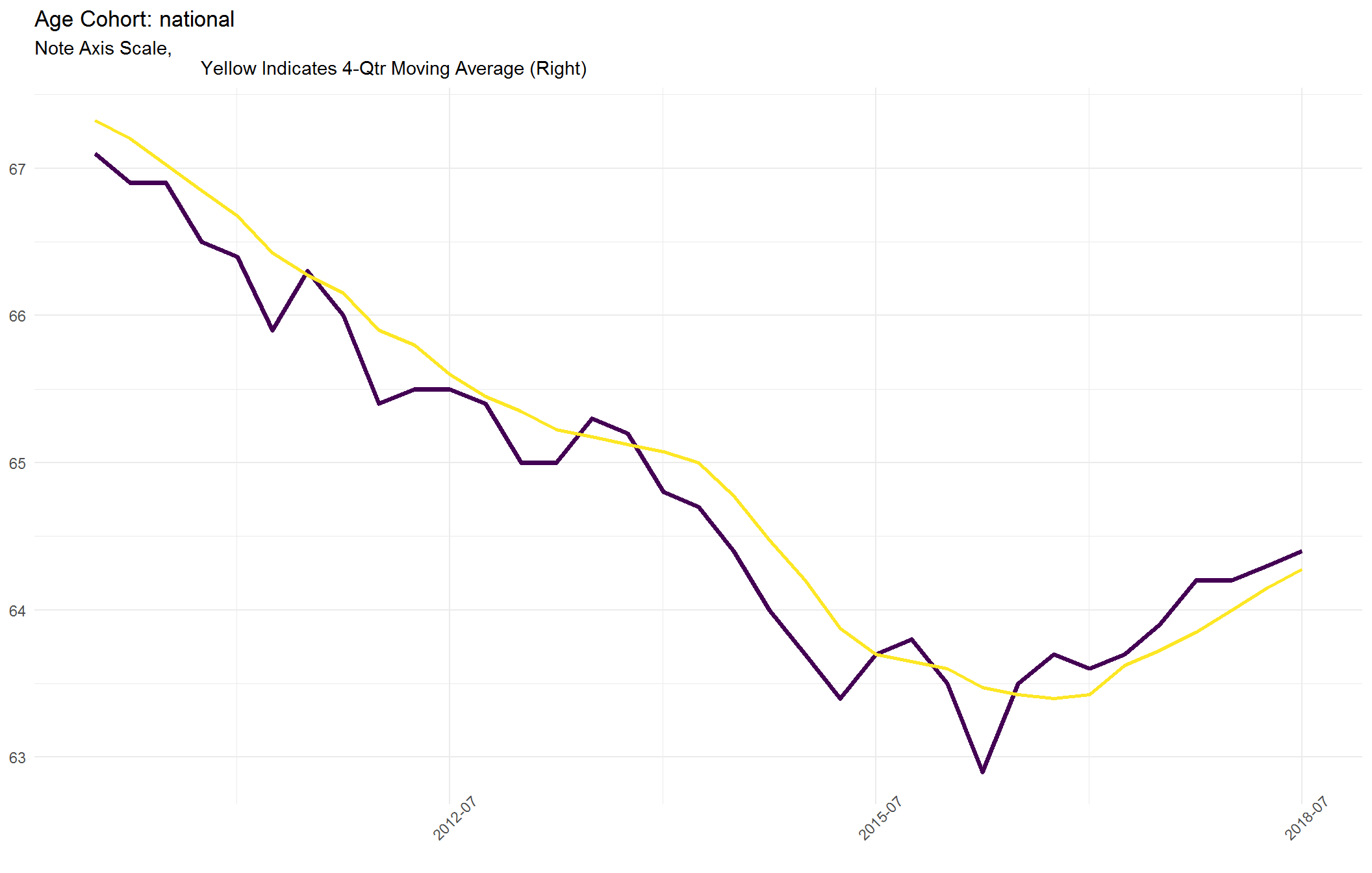
##
## [[2]]